First, for my concepts class, we had to do something we had never done before. You can read all about it here (on my class's blog), but let me just give you this hint: fast, dangerous, rebel-status. Yup. You know it :P
Second, today in my class we had to share some rough sketches of print ads for Superglue. We had brainstormed in the class before (along the lines of: "Come up with 10 ideas in 5 minutes for a Superglue print ad. Go!"), after which I went home, thought some more, and then sketched out ideas. Sorry for the less-than-great quality of the pictures (my camera is dying a slow and agonizing death) but here are some of my favorites:
An elephant, barbell, piano, bus, and whale superglued to the ceiling.
Tag line: It's that strong.
(You can kind of see the previous picture through this one... oh well!)
It says, around the picture of a crazy older woman with pursed lips:
"Superglue... has the strength of your cheek-pinching aunt."
This one is more visual. It's just Superglue with Arnold Swarchenegger's body and head.
Tag line: It's that strong. (← Maybe. I'm still working on this part...)
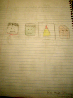
This was the idea I shared with the entire class. It has pictures of Superman, the Hulk, Superglue, and the Thing in a row.
Tag line: It's that strong. (Okay, so I actually only thought of the one tag line...)
Anyways, I don't know how interesting this is to other people, but it's important to me and this is my blog, so you all get to see my homework :P I had a lot of fun doing it and I'll probably keep you updated as I continue to polish the concept.


No comments:
Post a Comment